 |
| Description |
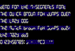
This font simulates the digital displays made of 7 segments.
Because those displays were originally made only to display numbers, some letters are ugly and/or ambiguous.
Ambiguities :
- '0', 'O', 'Q' and 'D' are identical
- '8' and 'B' are identical
- 'M' and 'N' are identical
- 'U', 'V' and 'W' are identical
- 'H' and 'X' are identical
- '5' and 'Z' are identical
- 'T' and 'l' are identical
- 'K', 'X' and 'Z' letters are hard to read
- 'f', 'k', 'p', 's', 'x', 'y' and 'z' are identical in upper and lower cases.
For better readability, I recommend to restrict usage of lower case letter only when the upper case is ambiguous. That is use lower cases b, d, q and t, and use everything else upper case. |
|

 Main
| Rules/FAQ
| Discord
| Memberlist
| Latest posts
| Stats
| Ranks
| Online users
Main
| Rules/FAQ
| Discord
| Memberlist
| Latest posts
| Stats
| Ranks
| Online users


